Printed Textile and Surface Pattern Designer

Monday 2 July 2012

New Designers 2012


Printed Textiles and Surface Pattern Design, Class of 2012.


After a chaotic yet productive week down in London at New Designers, i am back up in sunny Yorkshire having a bit of a breather! I met so many wonderful people and gained a few really fantastic oppertunities. One lead inparticular would be perfect if the placement goes well. Fingers crossed i will impress them and have the pleasure of working for such a great brand.

This week has taught me alot about the industry, in particular the importance of networking. Often its not what you know but who you know and therefore its important to talk to everyone!

Cao for now!

Thursday 17 May 2012

Arts Thread!

So as of today my graduate portfolio is officially live on the creative network, Arts Thread. I have uploaded manily imagery of my Final Major Project as well as one page of imagery showing pieces from my last project which also centered round a botanical theme. This is another valuable way of getting my work seen by important people!! Have a look!!!

Daisy Waite Arts Thread

Friday 11 May 2012

Final Show Progress

I have spent the last few days deciding which designs i am going to make into drops for my final show in June. I have selected two main designs, one of which i have already printed aswell as a third which i really like but not quite sure whether or not its too simple. For the remainder of this week i have been tweaking a previous design to make it sit better with the other drops. I have enjoyed this designing for purpose and i am pleased with how the design is coming along.


All imagery is Copyright Daisy Waite, 2012.


Wednesday 2 May 2012

Botanical Beauties!


This botanical inspired collection by Stella MaCartney is absolutely stunning. Referencing classical prints and paintings, Stella's deigns are beautifully composed and the colours within them are gorgeous. If i had a spare penny or two i would LOVE one of these lovely dresses, or a bag...!


As you may have already guessed, i am a big lover of all things British. There's something about British design which is endearing, classical and desirable. Both Barbour and Jack Will's pride themselves on being 'fabulously British'. It is brilliant to see another great british design company collaborating with both. Liberties of London have worked closely with both brands to add a touch of print to the original products. The addition of a liberty to print would improve anything!! Absolutely gorgeous... and again, if i had some spare pennies..!

Another British brand, Ted Baker have also jumped on the botanical print bandwagon this season introducing their 'Rose Bug' print which i adore. The colours are divine and hidden bugs and bees create a wheres wally effect which i love!


This print has been used to adorn a lot of different garments and accessories! Ted Baker are obviously aware of the beauty of this print... they have put it on every type of garment they sell!! I have my eye on the swimsuit but at a tasty £69, i might just have to keep dreaming!!

Monday 30 April 2012

Beautifully Botanical, Interior Wallpapers.


These designs are intended as large scale interior wall coverings to adorn walls throughout the home. Used individually as feature panels or in repeat to cover a wall, the delicate textures and crisp form decorate the walls beautifully.

All imagery Copyright Daisy Waite 2012.

New Designs for New Designers!!

Having been selected for New Designers i have found a new lease of confidence whilst designing. I feel a lot more confident in my over all authority as a designer to both make important decisions and trust my own judgements! With this new found motivation, i have created a small group of designs i am really pleased with, some which may potentially feature in my final show! All of these designs below are made up entirely of my original prints. These were created using hand picked flora and fauna, composed botanically onto an inked plate and pressed to create the imprint. I am so pleased i have been able to use a 'by hand' process in my FMP as i personally really value hand crafted design of any medium. I have taken the original prints further using photoshop, making as little alterations to the original as possible to create beautifully crisp and intricate wall coverings. Here are a few examples of my favourite pieces.


Original Pressed Print with natural colours.


Designs above and below are also from
original prints which have been inverted
using Photoshop.


All imagery is copyright Daisy Waite 2012.

I am most pleased with the inverted pieces as they are a really innovative and unusual take on the way classical/ traditional botanical printing would usually be executed. This regeneration of botanical printing is something i am really pleased with and both of these prints are highly likely to be used as drops in my final show and at New Designers!

Wednesday 25 April 2012

New Designer.

So today, New Designers selection was revealed and i was one of the lucky twenty chosen to exhibit! I am really really pleased. It will be the perfect way to round off my wonderful four years at Leeds College of Art and i feel privileged to be exhibiting my work alongside other great new designers!! I will be exhibiting during the first week, Part One from the 27th to the 30th of June this summer.

Friday 20 April 2012

Cream of the Crop!

Having foraged and collected a wide variety of specimens to print with on wednesday, i printed a number of pieces yesetrday which i am really pleased with. Here are a few quick shots of my favourite pieces. They'e not quite dry yet so unfortunately, i haven't been able to scan them in.. I am really looking forward to designing with them.


All imagery is Copyright Daisy Waite, 2012.


I love the crisp line and form achieved when printing with real flora and fauna in the press. The natural colours which seep into the paper due to the pressure of printing are beautigul and add that extra bit of life to the prints. When i get into designing with these, i wont be manipulating them very much at all. I want to keep the repeats as simple as possible so the prints can be seen in all their glory.

I also played around with creating a few textures which could possibly used for backgrounds or extra fill in certain areas. I really like the marks that were made as a surface textuer on their own and can see them working well with just a few simple specimens printed ontop perhaps in a ditsy floral style.


Thursday 19 April 2012

Botanical Printing...

Having decided i am going to use my prints within my designs for my main collection, i headed back down to the print room to generate some more imagery to work with! This time i wanted to work on a larger scale, putting more effort into the quality of the print so that less effort is needed when designing. I used a wide variety of flora and fauna freshly picked yesterday and kept in mind botanical documentation and composition all the time. Here's a sneak peak at how i got on!


Fauna arranged carefully on the print plate.


Lovely variety of elements within each print.


Print plate after first pressing, ready for a second!

Hopefully my prints will dry crisp and detailled allowing me to use them for my wallpaper collection. I am especially pleased with two i printed today. Their composition, vairety of scale and colour all work beautifully. Hopefully i can create beautiful wallpapers from this batch!

Wednesday 18 April 2012

Lovely Research.

I always continue to research throughout my project to make sure i am constantly inspired and subconsciously picking up new ideas and themes. Here are a few of my favourite images from researching the web today, in keeping with my botanical theme.


Indiana Fake Flowers


Stella McCartney


Gucci S/S 2012 Scarf

Steady Progress...

In my Reprographics slot last week, i printed out a number of my designs and statement prints in black and white so that i could add colour on top using a screen. Since then i have been able to get down to the print room and i have trialed this process. It was hard work at first mixing the colour to the right consistency in order for the hue to be vivid enough but also for the imagery underneath to be seen clearly. Eventually i achieved a good balance of colour with the cherry plum tone. Here are a few of the most successful samples.


All imagery and designs copyright Daisy Waite, 2012.

Foraging for Flora and Fauna in the rain!

Having used a lot of my prints already in designs, i need to briefly go back to the print room to generate some more imagery to designs with. I wanted to use similar plants and flowers to keep in touch with the theme and also so that the final collection is cohesive. Some of the florals i picked a while ago when it wasn't raining so much. The natural colours, patterns and textures are inspiring.


Scanning in a few pieces


Today, i went to Kirkstall in the rain to forage for some fauna with beautiful textures and form. I was amazed how much stuff i came home with! My house currently looks like a botanical museum with dissected plants and flowers covering any surface! I wanted to get a good quantity of quality pieces to print with as often once you have printed with a pieces once, they either tear when removing them from the printing plate or they curl up and dry out very quickly. Here are a few images of what i found. Hopefully i can start printing with some of my crop tomorrow!


All imagery Copyright Daisy Waite, 2012. 

The Crookes

Quick update about The Crookes, my brothers band based in sheffield. They have a brilliant new single out at the moment called 'Afterglow' available to download on iTunes along with their previous album. They are touring the UK throughout May and any of you heading to Benicassim, InsideOut or other similar festivals this summer, you will be able to catch them there!! If you haven't heard of them before they're definitely worth a listen!


thecrookes.co.uk

Tuesday 17 April 2012

Drapings.

I have also been draping a few of my preferred designs into interior scenes or onto suitable products. I find doing this really helpful in terms of working out scale, proportion and whether or not the distribution of the design is balanced. For some reason, i've found i much prefer my designs when draped on objects and products rather than walls. I am going to look into having some of my designs professionally printed onto phomeware products for my final show. Here are a few of my favourite drapes so far.


Large scale original fabric print.


All imagery and designs copywright Daisy Waite, 2012.

New Ideas...

Having had a quick chat with the tutors yesterday i have been testing out a few new ideas which use my original prints as inspiration. I really want for the design in my final show to be crisp and beautiful combining classical documentation and process with contemporary finish and vision. Here are a few things i've been working on today.


Cropped and composed fabric prints.

Cropped textures.


Fabric print in repeat.
All imagery and designs are copywright Daisy Waite, 2012.


Thursday 12 April 2012

Printing and Pressing.

Having collected a variety of flora and fauna i wanted to use these to create beautifully accurate prints to hopefully use within my designs. Achieving perfect prints definately took some practice. I quickly learnt not to put whole, fresh flower heads through the press as they exploded and printed a lovely mush on the paper. I learnt to dry my pieces out for a few days before printing and to try to press them prior to printing with ink so that the shape was slightly more crisp.

Once i got the hang of it i began to experiment with placement, layering and even adding a bit of text using John's metal letter stamps (thanks John!). Here are a few i made earlier!


All images Copywright Daisy Waite 2012


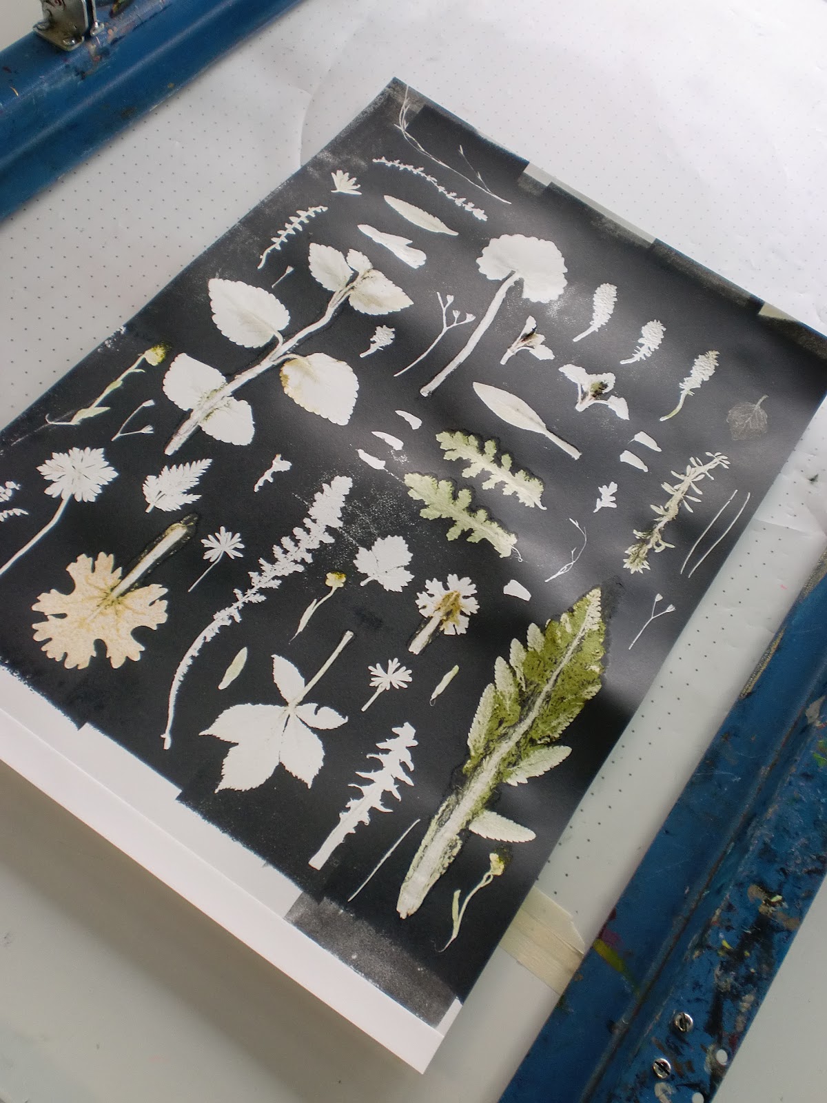
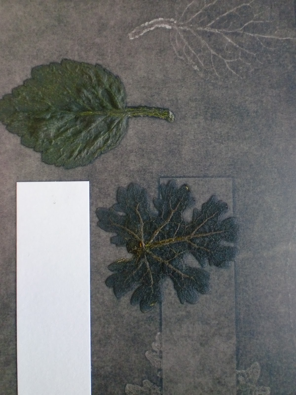
I am really pleased with these prints. The hardest part is finding intersting pieces to print with and then not ruining them in the press before you have created a nice print! The lat of the three above shows the direction i want to head in really referencing botanical documentation. Here are a few more from my second print session.


Development has been made with this second batch of prints in terms of selection of pieces and their composition has been more carefully thought about. At the moment i am printing to create a varied body of imagery to design with however i feel some of these prints could work really well on their own at a very large scale. I am particularly pleased with the quality of lettering achieved using metal letter stamps. All the text is printed and lined up by eye. This 'Vulgaris' print is a very successful print, others werent so good!

Continuing on from this session, i went onto experiment further with the styles of composition and what i was printing onto. I decided to see how fabrics worked through the press and much to my surprise they worked jst as well as paper providing a clean, textured print.


I am really pleased with the additional textures and details achieved when printing onto fabrics. These prints were on cotton duck, quite a thick, speckled fabric.