My brother George is lead singer and bass player of the up and coming British band, The Crookes. The Sheffield based band have already successfully completed a number of UK tours as well as playing a number of british festivals such as Reading and Leeds, Secret Garden Party and Latitude. They are currently in Europe playing exciting new venues and cities every night. I can only imagine what an amazing experience they are all having!
Whilst in Holland the band did an interview and live performance for a local radio show. They were asked to cover a recent pop song, a bit like Radio 1's Live Lounge. They chose Adele's, Rolling in the Deep'.
Have a listen... It's just lovely. x
The Crookes live cover of Adele's, 'Rolling in the Deep'.
Wednesday, 18 May 2011
Wednesday, 11 May 2011
Home Staright...
Its almost only a week until i finish my second year at uni! This year has been jam packed with challenging projects including our business module, competitions and contextual studies. Now we're in the final two weeks and the pressure is on. The judges from the Wallpaper History Society will be coming into the studios tomorrow morning to look at our collections. There is a really good standard of work throughout the studio so the competition is strong but hopefully mine will stand out.
Heres an image of one of my pieces from the collection in situ.

At this scale the designs look really impressive. I really like the quality of colour and the structural forms throughout. The whole collection embodies a british summer with beautiful blooms and brilliant colours. I am really pleased with my final collection.
Heres an image of one of my pieces from the collection in situ.

Saturday, 7 May 2011
Plodding on . . .
Since my last post, my project has changed direction swiftly. I began by looking at the human body and things gory!! I really liked this subject matter as it contained beautiful natural patterns. I was also really interested in the structures within these substances and how they had been formed. However, after playing around with a few images I decided that the subject wasn't going to provide me with enough source material to work from unless I went out and became a scientist for a week!
So, seeing as I am also entering this project into the Wallpaper History Society competition, I decided to look at age old florals. Always a winner in printed textiles! I found they encompassed much of the same qualities as the cells and substances i had looked at previously. I spent a few days taking lots of pictures and then I got aquatinted with Photoshop. Heres a few more I have played around with. I am a lot happier with these designs.
This style of reflection really works well with such colourful and beautifully formed flowers. I am on the right track now and I just need to keep working away until i have a collection of six that I am really happy with!
So, seeing as I am also entering this project into the Wallpaper History Society competition, I decided to look at age old florals. Always a winner in printed textiles! I found they encompassed much of the same qualities as the cells and substances i had looked at previously. I spent a few days taking lots of pictures and then I got aquatinted with Photoshop. Heres a few more I have played around with. I am a lot happier with these designs.
 |
| Pansies |
 |
| Pansies |
 |
| Poppies Copyright Daisy Waite. |
Thursday, 28 April 2011
Kaleidoscope Eyes ...
After a lovely relaxing two weeks at home, i am back up north and back to work! I've started to look at repeating some of the photos i took of the medical prints we found as well as some floral photos i took at Hilliers in Romsey. Here are the first few sample prints i've been playing around with.


These are different in many ways to the human body repeats. Even though they don't have as much outlined detail, the organic forms and beautiful coloration provide enough visually to create a stunning repeat. The florals are a lot easier to envisage in peoples homes on walls as opposed to the human body repeats. I would like to think that other creative people would appreciate the intricacy and complexity created through such simple methods. This contrast of imagery and process in itself is something i find interesting.


This was created from cropping the original photo which was of the whole head. I repeated this horizontally and vertically to make a symmetrical unit which i could then go onto repeat again if i wanted.

I am really pleased with the first few designs. They are only simple but i think this is what makes them so visually exciting. I have also started to play around with some of the images i got from Hilliers. The colours in these are gorgeous!

I think when my designs are finally printed onto the roll they will look really impressive. Scale is a big factor in terms of these prints being successful. Too small and all the detail is lost but then too big and the repeat is almost too simple. I want to find the perfect balance of complexity and detail combined with colour, form and a hint of structure!

 |
| Copyright Daisy Waite |
Wednesday, 27 April 2011
Devine Inspiration
Whilst clearing out the garage at home, my Dad unearthed a set of 1950's physiological medical prints that had been left in the house when we moved in. These prints are absolutely incredible. The colours are brilliant and i love all of the written labels and annotations. This informative element makes the prints both intelligent and interesting. Id love these sheets as wallpaper! Im definitely going to use these amazing prints as inspiration for my current project.


Friday, 8 April 2011
3rd Prize!
Today is a good day. I have arrived back home to wonderful weather, family and to the news that i have been awarded third prize for the 'Innovative Textile Process for Fashion 'category in the Bradford Textile Competition. I entered two pieces but won with the laser cut 'Contour' piece which i created within the second stage of an earlier project in second year.

I am delighted to have won and it shows me that it is definitely worth entering these competitions. So, now i have a curry lunch to look forward to in Bradford at the beginning of May when i go to collect my certificate.

I am delighted to have won and it shows me that it is definitely worth entering these competitions. So, now i have a curry lunch to look forward to in Bradford at the beginning of May when i go to collect my certificate.
Wednesday, 6 April 2011
Design Direction... Playing with cells!!
As i am looking so closely into the workings of the human body i widened my subject matter slightly so i could look at microorganisms, cells and bacterial substances. These samples can often be really visually exciting when magnified and the colours that appear are quite surprising. I have always been interested in the cross over between art and science and i feel that textiles and print are two of the best mediums to portray this subject.
I have always admired the work of Anne Wilson whose work focuses heavily on biological matter. One of my favourite pieces of hers is typologies. Made with numerous textile/ craft processes.

I am pleased with the outcomes of these trials and i think these will give me better quality colour than if i added it to my drawings as a block layer. I still want to try and incorporate some of my drawing into the final designs, i just haven't worked out how to do so yet!
I have always admired the work of Anne Wilson whose work focuses heavily on biological matter. One of my favourite pieces of hers is typologies. Made with numerous textile/ craft processes.
 |
| Typologies. |

This beautiful depiction of what might otherwise be seen as quite repulsive and unusual subject matter is stunning. I love the intricacy, the crafting of the piece, the link back to the traditions of textile techniques and the bold contrast between the black of the thread and the white of the board. This emphasizes the fundamentals in science, unlike art, it is either right or wrong.
Using cropped areas of magnified images of biological matter, i have played around with ways of repeating and manipulating the original unit to create a good design. I have only done a few so far...
 |
 |
 |
Design Direction
So the final project of second year is finally here!! As well as being pushed for time because of Easter holidays, this project is also going to be my entry for the Wallpaper History Society Anniversary competition due in early May. This doesn't leave me with a lot of time!!
Our previous project was just a quickie really, two weeks of drawing a chosen subject. I chose the human body, in particular everything inside from muscles, membranes cells and organs. This subject gave me loads of imagery to draw from and it really suited my unusual style of drawing. So, i decided to carry on looking at this topic in my final project.
I have started to do more drawings which i have been repeating and developing on the light box. I have taken the symmetrical repeating process used in my last project and applied it to some of my drawings.

 |
I am happy so far with the simple repeats. What i like most is how the complexity of the piece grows each time you add another element of repeat or symmetry. The idea that these once quite informative drawings are now even more complex is something i find interesting. Its the tiniest details which count the most too. Without these the prints would be purely line based.

 |

This is a handful of the repeats i like the most at this stage. I want to go on and increase the complexity as much as i can and also work out how i will eventually add some colour. As well as these drawn pieces, i have also been looking at magnified images of cells, micrograms and bacteria. I find these visuals fascinating.
Another artist/ designer who has looked at this idea and carried it out brilliantly is Alexander McQueen. Here's a few examples that i love.
 |
 |

These two examples of work by McQueen are beautifully accurate, aligned and symmetrical. In both cases, the line of symmetry has fallen straight down the centre of the dress elongating the figure and excentuating the waist. What is interesting and very clever is how the most intricate or visually structured parts of the print have been placed in key areas such as the waist and hips. By showing intricate structure and detail around the waist, immediately this part of the body seems smaller. I find it interesting as well that the pattern structure mimics that of the way a corset would have been constructed and how it would have behaved on the body. I really like this link back to historical fashion techniques.

These designs are also very similar to what i want to achieve with my wallpapers. I have been struggling to think how i could incorporate colour into my drawn designs without making them look like 'painting by numbers'!! This layering of block colour and drawings looks very clean and impressive. However, on a flat wall as opposed to the human body, i don't think it would work as well.
Innovation (Part Two) cont...
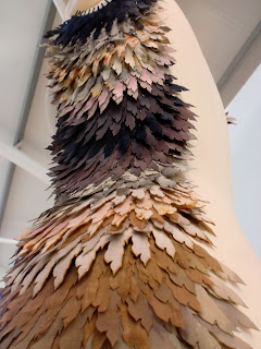
Along with my four fashion prints, i also created two laser cut pieces to make up my final collection of six. Even though i really enjoy the printing side of the project i will always love making things with my hands. So, i created 'Contour' the most successful of the two laser pieces. Still focusing on feathers, i got stuck into natural dye to colour my natural fabrics ready to be laser cut. I used natural dyes such as Logwood, Madder and Sanderswood to achieve subtle yet accurate colours of feathers i had looked at.
To add extra detail to some of the darker fabrics dyed with Logwood, i overprinted them by hand with devore paste and cirtic acid. Both of these are reductive processes, either taking away the original colour or altering it slightly. This addition of detail was meant to recreate the markings and detail sometimes found in feathers.
This piece was an early sample and it is one of my favourite things i have produced in my time at LCA so far. Partly because the outcome was so unexpected but also because of the coloration. The pattern that you can see is almost reminiscent of the form of feathers.


To add extra detail to some of the darker fabrics dyed with Logwood, i overprinted them by hand with devore paste and cirtic acid. Both of these are reductive processes, either taking away the original colour or altering it slightly. This addition of detail was meant to recreate the markings and detail sometimes found in feathers.
 |
| Soaked in Iron Mordent, died with Madder and Logwood. |
Quite a lot like the 'Delicately Damaged' Wall Covering i did in first year, a large part of this piece was all about the construction of it and the different layers merging together. So i spent a lot of time selecting individual pieces one by one to attach to the mannequin so the colours blended nicely.
Here's some work in progress photos:


 |
| This cropped section of the 'Contour' piece shows the variety of print and dye processes i have used throughout. The top layer is Logwood dye overprinted with Citric acid. And the patterned piece has been bundled with onion and berries. |
 |
| The piece as a whole was built to enhance the form of the body and emphasise the natural shape of the waist and hips. |


I am really pleased with the final outcome of 'Contour'. The most successful part for me is the construction and the beautifully delicate blend of colour and form. If the colours had been too varied the piece wouldn't have worked at all. My intention was to use the feather pieces to enhance and accentuate certain parts of the body. I feel that this has been achieved with elegance. I could really see this design in reality!
This is also one of the two pieces i entered into the Bradford Textile Society Competition. Hopefully it will do well. Fingers crossed!!
Innovation (Part Two).
For the second part of our first project in second year i designed four prints aimed at being fabrics for fashion. They are taken from detailed imagery of all kinds of feathers which i continued working with after the first stage of the project. I love the way feathers are so intricately structured yet beautifully organic in shape and form. This contrast of different line is something i find really interesting.


I wanted to collect a variety of feathers to use for drawing and to scan in and magnify. I found some gorgeous things in the woods at Raywell.
I began by cropping the photographs i liked into small blocks to use in repeat. I used Photoshop to mirror and symmetrically repeat the original 'units' and began building the prints. Here are the finished four.


I am really pleased with the final designs and they look absolutely stunning printed on silk. The colours are so vibrant and the emphasized structure is beautifully detailed. There is something about the symmetry of repetition that i love. I'm not sure what it is but i will definitely use this innovative style of repeat again. I think it suits detailed and almost analytical / scientific imagery.

 |
| I found this arrangement of feathers still in tact on the forest floor. It lends itself so well to the body, either placed on the shoulder or as an accessory on a hairband or a bags etc. |
 |
| These peacock fethares have such amazing colours. I also really liked the way there is structure to them however its quite organic, not too rigid. |

I began by cropping the photographs i liked into small blocks to use in repeat. I used Photoshop to mirror and symmetrically repeat the original 'units' and began building the prints. Here are the finished four.

 |
| This design is by far my favourite. The peachy layer adds a feel of age and delicacy which i love. I also entered this piece into the Bradford Textile Society Competition in the Fashion Fabrics category. |

 |
| Copyright Daisy Waite 2011 |
'Delicately Damaged'
This first year project was one in particular i really enjoyed. I love looking at structures and hidden patterns within objects/ materials. I am also really interested in the idea of damage and deconstruction which as a process peels away layers of materials revealing things i have never seen before. I chose to look at a particular type of seaweed that i scavenged from Fraisthorpe beach (East Yorkshire). As a natural object this seaweed had been worn away to show its different layers which were so remarkably similar to that of the warp and weft in fabric. This woven structure created texture, form and visual pattern.
As the project progressed, i became very good friends with Celia - the laser cutter! I cut out hundreds of different varieties of intricate seaweed pieces to eventually be layered up as a wall covering. I wanted the final result to imply a feeling of movement, growth and protection, ironically almost the opposite to the process of damage i initially looked at!


As the project progressed, i became very good friends with Celia - the laser cutter! I cut out hundreds of different varieties of intricate seaweed pieces to eventually be layered up as a wall covering. I wanted the final result to imply a feeling of movement, growth and protection, ironically almost the opposite to the process of damage i initially looked at!
 |
| Individual 'unit' |


The photos of this piece don't really do it justice. The most impressive parts were the scale and its overall texture. In hindsight, the charcoal was maybe a little bit too strong and if i did this piece again i would add more detail maybe use a variety of felts and natural fabrics to create a more accurate texture.
I also looked at repeating the individual seaweed units across the body to see how they sat.
 |
| Variation on original design, repeated around a point on Illustrator to create an arched form. |


I really like this additional use of the seaweed forms and they work especially well on the body at this scale. I have always had an interest in body adornments and i think this desire to work on the human body is growing more and more. The way in which i work using multiple units to create a whole really works well when applied to the human body. I think i will continue in this direction in third year.
Subscribe to:
Posts (Atom)